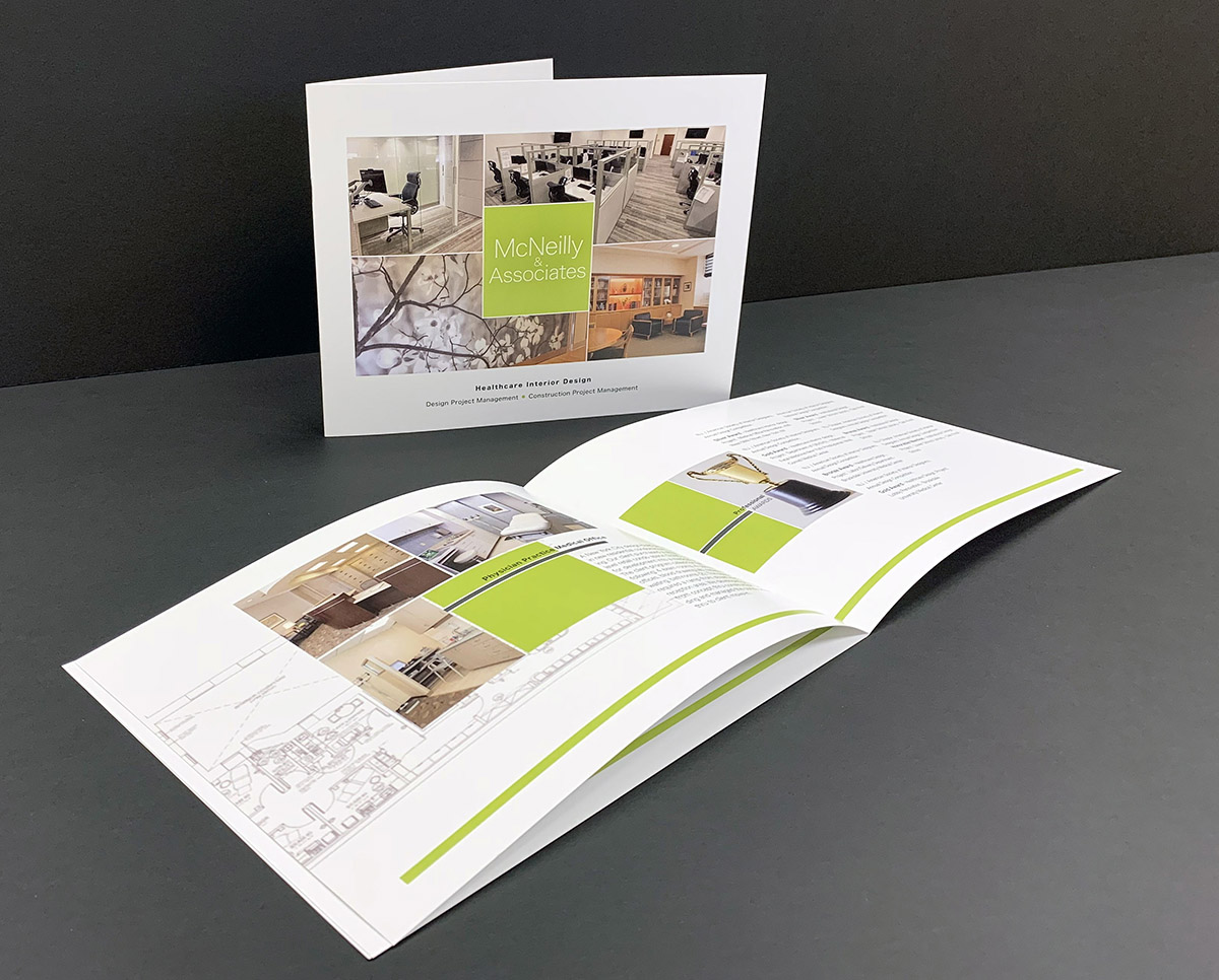
Our client had a dilemma: Even though McNeilly & Associates has a special niche as Medical Interior Designers, it was no longer feasible to visit hospitals and medical centers when the pandemic set in.
To replace in-person visits, they decided a brochure was necessary to describe their capabilities to potential clients. They searched online and found a company that would design a brochure to fit their needs. Upon receiving the final product however, they were disappointed. The colors were haphazard and there was no definite, cohesive look to the layout. It instead was a dated, generic template.
Resuming their search via a local business chatroom, recommendations were sought for a new designer since their money had not been well-spent the first time. Newark Trade was the recommendation they chose. They contacted us and we discussed what they were looking for in a brochure. Even though the cost would be greater than the online service previously used, they realized Newark Trade’s knowledgeable, talented, customer-oriented people understood their needs and what they hoped to accomplish with the piece.
Newark Trade was supplied with photos, floor plans, and wording — the exact same information given before. They let our team know what they hoped to achieve with the piece and what they were looking for (clean, modern, yet classic and easy to read). Our creative team suggested the use of the hospital logos for whom they had provided services. Newark Trade also recommended interactivity and animation in order to display information with the correct visual hierarchy while preventing over-crowding. We also color-corrected the submitted photos for maximum visual clarity.
We presented McNeilly & Associates a choice of layout designs, color palettes, and fonts. They easily chose what they were looking for, and we stayed true to the quote we gave them.
The result: Newark Trade designed an interactive, animated e-pub (a digital brochure easily sent to the clients they couldn’t see in person). As an added bonus: when you hover over each of the logos of offices they had designed, additional information becomes visible, making it a more clean, sophisticated and responsive piece. https://indd.adobe.com/view/733a294a-26ee-49aa-b78d-1b8ed7d38143
End result: McNeilly & Associates was invited to provide proposals for three high-profile projects with a potential client! The brochure got them in the door for the initial one-on-one meeting with key hospital project development personnel. Soon, more opportunities to come!
One additional need popped up: due to Covid 19 online protocols, many of their emails couldn’t get through some firewalls, so they now had another request: could Newark Trade reformat the digital brochure for printing? Printed pieces can often get through more easily than email. Our team reworked the piece, and the design is still clean and legible. We printed it along with custom note paper and envelopes.
Why it Pays: This brochure became our client’s most successful leave-behind sales tool. Newark Trade’s beautifully designed brochure demonstrates the focus of our client: what McNeilly & Associates can do for their clients.
Another happy Newark Trade client!
At Newark Trade, each client is paired with one account executive who will be there for complete customer support. Let us know how we can help your company show off its best face to prospects, even while wearing a mask!